Dan English's BI Blog

Welcome to my random thoughts in regards to Business Intelligence, databases, and other technologies

Posts Tagged ‘excel’

SQLSaturday 453 Minnesota Follow Up

Posted by denglishbi on October 29, 2015

A couple of weeks ago I had the pleasure of speaking again at SQLSaturday Minnesota. This year it was at a new location in downtown Minneapolis at the St. Thomas Graduate Campus. Once again SQSaturday MN 453the planning team and volunteers did a wonderful job of organizing the event and having everything ready. Awesome job!

The session that I did this year was What’s new in Excel 2016 for Business Intelligence.  There were over 40 people in attendance at the session (first one of the morning) and everything went as planned, no demo issues:) I covered the new features in both Excel 2013 as well as 2016. No one in the room was using 2016 yet (not sure if anyone new it was even released yet – was released on Sept 22) and everyone was using 2013 (majority were not aware of the new features in 2013, so good thing I had that material readily available).

The new features I highlighted in Excel 2016 were the following:

  • Tell Me – search for features (probably my favorite addition to Office – provides instant access to the feature as well)
  • Sharing – much simpler
  • Version History – needs to be in SharePoint or OneDrive
  • One Click Forecasting – okay, takes more than one click, but very niceExcel Logo
  • 6 new chart types – treemap, sunburst, waterfall, histogram, pareto, box and whisker
  • PivotTable enhancements
  • Multi-select Slicers
  • Get & Transform Data (native Power Query in Data tab)
  • 3D Map (native Power Map on Insert tab)
  • Publish to Power BI
  • Power View works with Multidimensional (but Power View is a hidden item because of Silverlight and a bit of a challenge to add back into Ribbon – wouldn’t recommend, use Power BI Desktop instead)

If you would like to check out my full presentation that also includes the new 2013 features download the material here – [Demo] – SQLSat453MN_Excel2016BI_denglishbi_20151010.zip

Thanks to everyone that attended and look forward to the next event!

Posted in Training | Tagged: , , , | Leave a Comment »

Installing Data Explorer Preview & Demo with IMDB Data

Posted by denglishbi on March 4, 2013

I can’t believe it has been over a year since I posted about Data Explorer in my post Installing Data Explorer Desktop Client.  That was covering the initial release of the client plugin that used the cloud based service from SQL Azure Labs.  Now there has been a considerable amount of work done and there is a public preview of the new COM Add-In you can download and use in Excel. 

Let’s take a look at the requirements:

Systems Requirements

Supported Operating Systems: Windows 8, Windows 7, Windows Vista, Windows Server 2008

  • requires .NET 3.5 SP1 or greater
  • Office 2013 or Office 2010 SP1

You can download the 32 or 65-bit version of this from the Microsoft Office area – Download “Data Explorer”.

image image image


image image image

Here you can see the download loading in Excel 2010.

image 

Here is the add-in being displayed in the ribbon along with the options that are available.

image

Version: 1.0.3207.2 (published 2/25/2013)

image

Now I am going to switch over to Office 2013 because once I get the data loaded into Excel I want to use Power View:)

image

Every time I tried to install the .NET 3.5 framework feature on my Windows 8 machine as well as download and install it from the URL specified I kept receiving the message that it was not able to install and returned the error code 0x800F0906.  I did a little searching and came across this KB article from Microsoft:

Error codes when you try to install the .NET Framework 3.5 in Windows 8 or in Windows Server 2012

I mounted my Windows 8 software and ran the following command to install this feature:

Dism /online /enable-feature /featurename:NetFx3 /All /Source:d:\sources\sxs

(where the ‘:d:’ is the drive letter for the Windows 8 media)

Here are the results of running this to get the framework installed from the command prompt:

image

Once that was finally setup I was able to install the add-in and it was available to load in Excel 2013 (and I am using Office Professional Plus 2013).

image

A little different experience for me with Excel 2013 instead of Excel 2010, I had to go into my COM Add-Ins and enable “Data Explorer”. Where as previously in Excel 2010 it was installed and enabled.

image

Here is the ribbon layout in Excel 2013, same as in Excel 2010.

image

For this example I am going to use the Get External Data->From Web option and tap into some information on the IMDB web site.

image

IMDB Charts: IMDb Top 250 – http://www.imdb.com/chart/top?ref_=nb_mv_3_chttp

Here is what the web page looks like that I am going to extract data from:

image

After I click apply the Query window opens and I can see what is available for me to access, in this case I am interested in Table 0.

image

NOTE: it would have been super cool if the hyperlink URL reference that was on the web site for the movie titles was included in this table, unfortunately it was not, so that forced me to do a little more additional work later on to enrich my data for Power View.

I am going to right-click on the Title column and split the column into two since the year the movie was released is included.
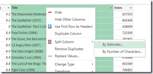
image

To split the column I am going to use a custom delimiter of a space and left parenthesis.
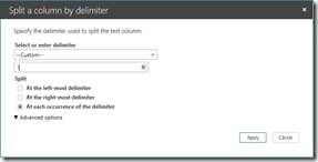
image

Now you can see the new column that was created and I have two columns, Title.1 and Title.2

image

Now I am going to cleanup the Title.2 column and replace the right parenthesis.
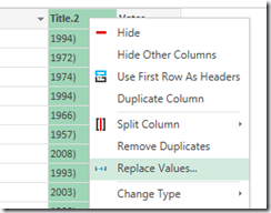
image

I will replace the right parenthesis with nothing and apply that change.

image

Now you can see the Title.2 column is cleaned up.

image

I am going to quick browse the values just to verify this and wouldn’t you know, I found one more item that needs to be evaluated.

image

I filtered for just the records with the 2011/I values and one record is displayed for “The Artist”.

image

I take a quick look at that move on IMDB and I see that after the title there is that additional (I), so that must be causing the issue.

image

So I will add another replace condition on the Title.2 column to cleanup that record and replace /I with nothing.

image

The next thing I need to do is take a look at the Steps pane on the right-hand side and you can see the trail of steps that I have performed so far.  You can review them and in this case I am going to go back to the FilteredRows step and delete that step to remove the filter.
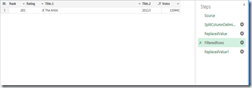
image

I get a warning about deleting a step in my process letting me know that it could impact subsequent steps, but I am okay with that.

image

Now we have my final dataset that I want to work with and this gets added into a new worksheet in Excel once I click Done in the Query window.

image

Now with a little of additional work with help from some calls out to the Internet and VBA we can get some additional information about these movies and make a Power View report like this (I made some additional adjustments to the model in PowerPivot as well, but this is more about Data Explorer, so we will skip that side of things):

image

The Rated ‘R’ movies have the most votes and you can see they have the top ranked moves as well by looking at the card layout.

By clicking on PG-13 in the bar chart in the middle we can filter the entire report – cards, summary data at top of report, as well as the column chart.

image

Based on the top 250 ranked movies from IMDB we can see that the average PG-13 movie has a rating of 8.2 and “The Dark Knight” has the highest rating of 8.9 with over 900 thousand votes.

I tracked down one of my favorite movies, “The Matrix”, and it was ranked 19 with an overall 8.7 rating.

image

We can also see down below that starting in the 60’s, the ‘R’ rated movies started to gain some traction and as the years go on those are the more favored movies, quite the difference compared with earlier decades where it was dominated by the ‘Approved’ rating, but maybe ‘R’ was not even a classification back then.  More than likely if we had some demographic information on the voters we would probably see some correlation with that as well.

image

That is it for now, a quick preview of the install process as well as tapping into some data from a web URL, which in this example was IMDB.

You can check out some Getting Started, Tutorials, and How-to information here – Data Explorer Help.

Posted in Data Explorer | Tagged: , , | 5 Comments »

Book Review: DAX FORMULAS for PowerPivot: The Excel Pro’s Guide to Mastering DAX

Posted by denglishbi on November 15, 2012

This week I got the opportunity to read a new book out on the market by Rob Collie (PowerPivotPro) – “DAX FORMULAS for PowerPivot: The Excel Pro’s Guide to Mastering DAX”.  I have to admit that once I received the book I read through it in a couple of days, couldn’t put it down and wanted to finish it.  I really enjoyed the style of the book, just like Rob’s blog posts, and there was just a really good natural transition of the content that it kept me hooked.  While reading the book I really felt that I was in a classroom and Rob was presenting the material, something about the writing style, really enjoyed it (hat tip to Rob).

The book is loaded with great tips and advice from Rob, reference links to his blog posts and other content, and real world examples.  The solutions and examples provided in the book can be used right away if you are already using PowerPivot or Tabular SSAS.  There is material in here not just for the Excel pros, but also for IT/BI pros as well.

The second night I was reading the book my son took a peek at what I was doing on my Kindle Fire HD (great reading experience by the way – color, access to the embedded pictures to enlarge, ability to access the links directly, easily take notes and add bookmarks).  My son is in first grade and really starting to get comfortable reading.  He started to read the page I was on:)  It was really cute.  The book was not only good for me, but helped my son learn new words and work on his reading (not sure if this book can qualify for an AR test though)!

When it comes to the editing of the book I did come across a some minor typos, nothing too major, and one figure was missing (Figure 154).  There are references to the Measure Grid (actually Calculation Area in PowerPivot, Measure Grid in Tabular SSAS – this is one thing that I wish Microsoft kept the same or consistent for referencing).  I got a laugh when Rob states that implicit measures are ‘dead to me’ and that he never, ever, EVER creates implicit measures.

The book is really invaluable and the price is a steal (particularly if you buy it on Mr. Excel’s store here)  The length was exactly what I like, short and to the point, I don’t want to read a 800 page door stopper, anything in the 300 or less page range is perfect (that is why I liked the Rational Guide books by Rational Press) and supplemented with links for additional references and more content if desired.  The material and insights that Rob covers is fantastic.  The disconnected table concepts as well as performance tips are PRICELESS.  I would highly recommend this book and without a doubt give it a five star rating.

image

Posted in PowerPivot | Tagged: , , , | Leave a Comment »

Using PowerPivot Model Images with Excel 2013 Power View

Posted by denglishbi on September 13, 2012

[tweetmeme source=”denglishbi” only_single=”false”]

As you have heard and possibly seen in my other Excel 2013 posts, Power View is coming to the Office suite.  This is great news to everyone that uses Excel.  The one thing you might be curious about is how to include and reference images within your data model.  This post will cover the options that you have and provide a few screenshots of the process.

Database Images

If you are working with data that resides in a database and the images are stored in the database table you will be able to work with them once you load the data into your data model within PowerPivot.  This hasn’t changed at all, the only thing that has changed is that now you don’t have to upload your PowerPivot file into SharePoint to create the Power View report.  Instead you can simply insert a new Power View report and create your reports.

Here is a quick look at this type of a setup.

First the database tables have to be in place.  In this example I am going to reference two different tables that will have images in them, one for authors and the other for books.

image

Once the records have been added to the tables we just need to add the images and one way to do this is with some T-SQL and OPENROWSET command as displayed in this blog post here – Insert binary data like images into SQL Server without front-end application.

image

Once the data is in place we need to create our model, so we will open up Excel 2013, go into the PowerPivot window, load the data into our model, define relationships, and do some advanced setup on our tables.

Let’s take a quick walkthrough of this process if you are not familiar with this yet.

image

Once you have activated the PowerPivot add-in in Excel 2013 you will be able to select that tab in the ribbon and manage your data model.

image

Once you are in the PowerPivot window you will be able to get external data and import data into your model.

image

Select the tables you want to work with in your model.

image

Import the data.

image

Switch over to Diagram View and drag-and-drop the fields to establish relationships between the tables.

image

Select the Author table and define the Table Behavior so you can define the default label and image for each record.  Do the same for the Book table.  Now that you have that setup one last step you can do before you start to use the model is to perform some cleanup.

image

Here we have hidden the two row identifier columns in each of the two main table and also hid the reference table that relates the two tables.  You can do this by simply right-clicking on the items and selecting ‘Hide from Client Tools’ from the context menu.

Now you can switch back to Excel and from the Insert tab in the ribbon select Power View.

image

Now we will see the two tables in our model and the item that we are particularly interested with is that the Photo column is available and the key step was the configuration step in the Table Behavior.

image

Now we can select the items in the field list and start to put together a report such as this –

image

Web Server Images

Another option you have for referencing images in your Excel PowerPivot model is to store the image files on a web server.  The one thing that you need to make sure is that the web site is setup with Anonymous authentication and users have permissions to the file location.  Once that is setup you can establish a URL reference to these images files in your table within your model.  After the URL is configured you will need to review the advanced settings just like the database image setup so that you can reference the images in your Power View report.

Let’s take a quick look at the difference here.  First we have the anonymous web site.

image

Then we place the files on the web server to reference in the location we defined for the web site.

image

Make sure that users have access to the location.

image

Now we go through the similar steps as we did in our first example, but after we define our relationships we need to go back into our tables and define the URL paths for our images.

In both tables we will create a calculated column called PhotoURL and with some DAX setup the paths to the images.

image

image

The secret here is to make it data driven, if you are not able to do this then you would need to store the URL values in the source table and import them.  Luckily with a little DAX we could setup a formula that will work for each record.  Now if someone wants to replace one of the images on the web server they can do so and it would be reflected in the report with a refresh.

The next step is to go into the Table Behavior like we did in the previous walkthrough and make reference to this new column for our default image.

image

Once this is done we can go ahead and switch back to Excel and create a Power View report, just like we did previously.

The one thing to note here is that when you switch over to the PhotoURL reference you will be prompted with a security warning about accessing external pictures.  Go ahead and click ‘Enable Content’.

image

Now we can look at our same report –

image

Only this time we are using the PhotoURL versus the Photo field.

image

Conclusion

And there you go, two different options for referencing and using images within your Excel 2013 Power View reports.  Using the web server setup is nice because then you can swap out the images a bit more easily, but you still have the option to store the images in the database if that is how you where you want to keep them. 

Now go ahead and try this on your own and really spice up your reports with some nice images:)

Posted in PowerPivot, Reporting Services | Tagged: , , | Leave a Comment »

Visualizing Data with Power View: Pan-Geo goes PowerPivot

Posted by denglishbi on August 9, 2012

[tweetmeme source=”denglishbi” only_single=”false”]

Back in June we released our book on Power View, Visualizing Data with Microsoft Power View.  Not only does the book contain great information about creating reports with Power View, but it also contains content on building tabular models that can be utilized with Power View.  The current release only works with tabular models, so either PowerPivot or Tabular Analysis Services (SSAS).  With our book we primarily focused on building out a Tabular SSAS solution that gets used for the majority of the Learn By Doing exercises.  Sure there are a few times where a PowerPivot file is referenced or we do some initial modeling in PowerPivot, but most of the work gets done with the tabular solution that gets deployed to Analysis Services.image

Well just a few weeks ago when Office 2013 Preview was released I decided to build out the entire Pan-Geo Hospitality & Travel model in PowerPivot.  I went ahead and replicated all of the exercises that we did in the tabular project into PowerPivot (using Excel 2010 and the SQL 2012 PowerPivot add-in).  I then took that same file and upgraded it up to Excel 2013 as well – Power View Meet Excel 2013.

image

So since I took the time to build this out I decided why not go ahead and share:)

If you are interested in Power View and especially if you have already purchased the book (hint, hint) I have gone ahead and uploaded the two Excel files to my SkyDrive here – Power View Book.

  • PGHT Tourism PowerPivot Model 2010.xlsx (Excel 2010 uses the SQL 2012 PowerPivot add-in)
  • PGHT Tourism PowerPivot Model 2013.xlsx (Excel 2013 uses the PowerPivot for Excel 2013 add-in)

Now in order to get a good download of these don’t open the Excel files up in the browser in SkyDrive, simply check the box next to the file and chose the download option on the right-hand side of the screen.  I would do them separately.  Then simply open them up and have at it.  Now if you want to use Power View in Excel you will need to download and install the Office 2013 Preview.  If you want to build out map reports with that you will need to make sure you have an Internet connection so that it can connect to the Bing Map service.

I would be very interested in some feedback and seeing what people build out with the PGHT dataset.  So feel free to leave a comment here or send me a tweet (@denglishbi).

Just an FYI, the Power View book is available on McGraw-Hill Professional, Amazon, Barnes & Noble, Google Books, as well as Kindle, Nook, and other eBook formats and sites.  Please check it out and leave us your feedback and comments:)

Enjoy!

Posted in PowerPivot, Reporting Services | Tagged: , , , | 2 Comments »

SQL Saturday Event Analysis using Power View and Office 2013

Posted by denglishbi on August 6, 2012

[tweetmeme source=”denglishbi” only_single=”false”]

Updated (8/7/2012): Added screenshot at end of post of which includes data broken out by fiscal calendar (starts in July) and link to that file as well.

Updated (8/9/2012): Added some information at the bottom of the post in regards to downloading issues and more information available in the comments section.

Last week I saw a post by Sam Vanga called SQL Saturday US Map.  Needless to say I found it interesting and a great idea.  That made me think a bit and I was like hmm… why not take that same data and use it with the new Excel 2013 with PowerPivot, Power View, and maybe even a little Office 365!  I had to leverage the Microsoft stack of course:)

So I went out to the SQL Saturday site and copied down all of the event details. Needless to say a little scrubbing was required because the data was a bit incomplete to get at some of the location information.  After a little while I felt fairly good with the data and loaded the information into PowerPivot for Excel 2013.  I added a few more columns around the date information to generate a calendar and to do some sorting.  Once that was done I went ahead and started to put together a little dashboard page.  I ended up with the following:

image

We can see that the SQL Saturday events over the past couple of years have really grown in popularity and after 2010 they went global as well.

image

We can zoom in on the map and get a close up as well.  Last year we had the SQL Saturday #99 in Eden Prairie, MN.

image

I even added the ability to drill down from the cities to the zip code level and also some drill down on the column chart for the counts as well.

image

image

Some pretty cool stuff.

We can even upload this into the Office 365 preview and share this information as well which support PowerPivot and Power View.

image

You might notice that the colors for the themes don’t match up quite yet, but other than that it works out well and you can interact with the Power View visualizations and reports!  In the above screenshot in Office 365 I have the tile where the map resides filtered to 2012.  You can see that the map really opens up now for the entire globe compared to the 2010 and 2011 views.  I can only assume that next year it will grow even more:)

The data that I grabbed for this was from the SQL Saturday events page here (just copy paste and a bit of cleanup).

If you would like to download the Excel 2013 file I created you can grab it from here – SQLData.xlsx

Fiscal Year Layout

I received a request from Karla Landrum the PASS Community Evangelist to see the data setup using the PASS fiscal calendar which starts in July versus the regular calendar.  Well I decided to add in a full date table and refresh the output.  Here is the result and the new file can be downloaded here – SQLDataFiscal.xlsx

image

If you are experiencing any issues with the downloads take a look at the comments section of this post.  I did some testing and found some issues if you try to directly download the file from the browser and a workaround if the SQLSat Dash does not load for you.  You can download the file(s) from my Public|Blog SkyDrive folder.

Enjoy!

Posted in PowerPivot, Reporting Services | Tagged: , , , | 15 Comments »

Excel PowerPivot SQL 2012 vs. Excel 2013 Performance Demo

Posted by denglishbi on July 30, 2012

[tweetmeme source=”denglishbi” only_single=”false”]

I just wanted to do a blog post to demonstrate a performance situation I ran into last week.  I had created a PowerPivot model in Excel 2013 and it performed very well (quite the understatement, phenomenal) when creating PivotTables and Power View reports.  I then went ahead and recreated the model in Excel 2010 with the SQL Server 2012 PowerPivot add-in.  The model creation went fine, but when it came to trying to replicate the report I ran into a slight snag.  Well I actually couldn’t even complete the report, I ran out of memory on a box with 8GB of memory.image

We decided to upgrade the box and gave it an additional 4GB of memory, but that didn’t change anything, the query still consumed all of the memory and wouldn’t complete.  We decided to test this out and migrate the model to a Tabular SSAS instance on a server with 64GB of RAM.  Well the query for the PivotTable just kept running and we watched the Analysis Services process climb to over 18GB and it was still climbing with no results coming back.  Needless to say I was confused and a bit embarrassed.  I decided to give it a go in Excel 2013 again and once again no issues and the results were very fast (might even say blazing fast).

To demonstrate this I have gone ahead and created a demo of the exact scenario with a very comparative sample so you can get a feel for what I was seeing, just take a look at this video:

Excel PowerPivot Performance Demo from Dan English on Vimeo.

In reaching out to the product team I discovered that in Office 15 there have been some performance improvements when it comes to dealing with filters.  Well we can definitely see that based on my results:)  It turns out that these same performance improvements will be coming eventually to the current version as well, we just need to wait for the release of SP1 for SQL Server 2012.  Some of the improvements seen will also be available to querying the data in Analysis Services as well, both Tabular and Multidimensional!  So just hold on until SP1 is released.  If you want to checkout the performance improvements today have a go with PowerPivot for Excel 2013 (you will not be disappointed).

Posted in PowerPivot, SQL Server | Tagged: , | 4 Comments »

Power View meet Microsoft Excel 2013 Part 2

Posted by denglishbi on July 25, 2012

[tweetmeme source=”denglishbi” only_single=”false”]

Last week I did my initial post of going over using Power View inside of Excel 2013 – Power View meet Microsoft Excel 2013.  In that post I went over how I converted the PowerPivot model of the Pan-Geo Hospitality & Travel that was used in our Visualizing Data with Microsoft Power View book (well at least a Tabular SSAS version was used, I recreated the entire model in PowerPivot).  I upgraded that model to use the Excel 2013 version of PowerPivot and then showcased some of the new features such as:

  • Background Images
  • Pictures
  • Themes
  • Relationships
  • Pie Charts
  • Map Visualizations (Bing Maps)
  • Key Performance Indicators

So what other key features are that that might be of interest?  Hmmm, good question.  And yes, there are more features.  Have you been wanting support for hierarchies?  What about drill up and down capabilities?  Well guess what, you get them both:)

You might have noticed in the previous post that you saw some hierarchies listed in the field list:

image

Let’s take a quick look at using the Country Hierarchy and see how this looks in a table, matrix, and a chart.

Table

image

Matrix

image

Chart

image

So in the table and matrix no change other than the fact that we can see our hierarchies in the field list and select them.  This allows us to quickly add multiple fields to the canvas.  What about the chart though?  I picked the country hierarchy, but I am only seeing the first level of the hierarchy which are the continents.  Where are the countries?

Well if you double click on the columns in the chart it will actually drill down into that continent and display the data for the countries!

image

You will also see that the sort by and title text changed to display country and there is a new icon available when you hover over the chart, an arrow that provides drill up functionality.  So the drill up will bring you back up to continent. 

Now the neat thing about the drill up and down functionality is that you can expand on this.  The fields do not necessarily need to be part of a hierarchy, you can actually build out the drill up and down capabilities by adding fields into the field well.  So in this example I will add more fields into the chart below the country:

image

So let’s double click a few times to see what we get:

image

image

Now the one thing is that we really are not sure what we are looking at, meaning that what continent, country, and chain type did we select previously?  I can see based on the sort the trail that I have navigated, but what were the values associated with them.  That would be a nice feature.

The drill down also works for the map reports as well.

image

So if we double click on the China pie chart we will go down to the city level based on the navigation defined in the field well:

image

And you can use the zooming capabilities of the map as well.

image

Pretty cool and you can do more with the map with the layout settings in the Ribbon:

image

In addition to hierarchy, drill up & down, and cool map capabilities there is another minor addition that was added and that was support for hyperlinks in a text box.

image

In this example I have a text box that includes the words ‘Microsoft BI’ and below that a hyperlink to the web site.  If I hold the CTRL key and click on the hyperlink it goes to the web site:

image

They hyperlink simply gets added after you type in the URL and press a space, hit enter, or click out of the text box.

Well that covers the majority of the new enhancements to Power View, for the complete list checkout the links at the bottom of my previous posting – Power View meet Microsoft Excel 2013.

I will continue to work with the new features and post any additional findings I might come across like using images from the data models and the issues you might encounter along with using these files in SharePoint.

Posted in Business Intelligence, Reporting Services | Tagged: , , , | 13 Comments »

Power View meet Microsoft Excel 2013

Posted by denglishbi on July 19, 2012

[tweetmeme source=”denglishbi” only_single=”false”]

This week Microsoft released the Public Review of Office 2013 (aka Office 15).  You can download and check this out now for yourself and read some reviews of the new changes here:

One of the items that I have been patiently waiting to talk about and demonstrate is the new Power View and not only the new enhancements to it, but that it also is available in Excel 2013!  With Excel 2013 the PowerPivot and Power View COM add-ins are provided with the installation, you simply need to enable them in the Options->Add-Ins section.

Before I dive into the new Power View let me show a quick screenshot of one of the Power View reports from our Visualizing Data with Microsoft Power View book.

image

A couple of things I want you to take a look at primarily is the field list.  Also you will be able to compare this look to the enhanced one that I will now show off in Excel 2013.  To create my Excel 2013 I decided I would go against a complete Excel solution, so I created a complete Pan-Geo Hospitality & Travel PowerPivot Model.  I did this first in Excel 2010 and then upgraded this in Excel 2013 by accessing the Model in the PowerPivot Ribbon in Excel 2013 (you will notice that in this screenshot you will see two PowerPivot tabs and that is because I have both versions of Office running along with the add-ins (PowerPivot for Excel from SQL 2012 and now the one for Microsoft Office PowerPivot for Excel 2013).

image

When I opened up my Excel 2010 file with the PowerPivot model in Excel 2013 (which I also enabled the PowerPivot add-in) I then went to the 2nd PowerPivot tab in the Ribbon and clicked the Manage button in the Data Model section.

image

Could really use a line break in this warning message box:)

image

So just to reiterate the situation and give you an option to cancel.

image

Time to reboot:)

WARNING: I did notice one issue with the upgrade, the KPI that I had defined in my Excel 2010 PowerPivot model did not convert over, so I had to create the measure from scratch and setup the KPI again

Once I had the model converted over I used the new option in the Insert tab of the Ribbon for Power View (right in the middle in the Reports section)!

image

If you click on this and you do not have the add-in enabled you will be prompted and you can enable it then.

image

This creates a new worksheet in the workbook and then you can start building out your report, just like you can do with the current version of Power View, but this time you are doing it in Excel and not in your web browser as part of the Reporting Services 2012 integration with SharePoint 2010.

Here is what I ended up with recreating the Hotel Performance Dashboard report displayed above (notice if you can see a few extra items I have added and any other differences):

image

Did you see anything new on the report?  No, not the fact that I changed the Play Axis in the scatter chart or the data labels being added in the bar chart.  Look closer….okay, so you did see it, there are images included in the report and they are not part of the model definition!

The first one that I will point out is in the top left hand portion of the report and the new option I used here is the Picture option in the Insert section.

image

You can include Image files now so you can include the company logo as a report header (jpg, jpeg, and png files).

The other image you see is in the background of the report and for this I used the Set Image option in the Background Image section.

image

Here you can select the same type of image files as the picture and then you can specify the position option as Fit, Stretch, Tile, or Center. Along with that you can specify the transparency level and here I have it set to 90%.

Pretty neat, right?

Well you can do more formatting.  If you recall in the existing Power View we have Styles – Using Styles in Microsoft Power View.  In the new version here we can really tweak the report setup using the Themes section.

image

I can change the Font from Segoe UI to Times New Roman. I can select a different Theme, adjust the Font Size, and alter the Background (these changes are all at the report level, not item).  The result (not saying this is ideal) ends up looking like the following:

image

Another interesting item you can do here in Power View is in the Data section of the Ribbon.  You can actually review and modify relationships.

image

Pretty slick.

Let’s quick go back to the second screenshot above and take a look at the Field List.  Notice something different here?  What are those Globes and Spotlights doing in the list?  Yep, you guessed it, Power View now provides geo-coding capabilities to use with the new Map visualization, plus it also supports Key Performance Indicators (KPIs)!  In addition to the new Map visualization, the Pie chart has also been made available.

image

You can even include Pie charts in Maps (just a bit of a warning here, currently the Pie charts do not support data labels, similar to PerformancePoint Analytical Chart reports).

The mapping capability uses Bing Maps just like SSRS does for some of its mapping that was introduced in SQL Server 2008 R2.

image

Here is an example of a Map (including Pie charts, just to put it over the top):

image

You can see in the Field Well that there are new spots for Locations, Longitude, and Latitude.

If you are looking for the Card visualization it is now under the Table.

image

Now what about those KPIs, how do those look?

image

Well, looks like we still need some work here, but it is a start.  The indicators it is using are not correct.  I would like to see a more condensed view and options here to provide the detail information about the KPIs, but at least we can include them now.

Now there are more new items and capabilities that I haven’t even touched on yet, so stay tune for another post next week.

For more information about the new BI features in Office 2013 check out the following links:

Enjoy and kudos to all of the Microsoft teams that were involved to make all of this happen!

If you liked this post, check out the 2nd part here – Power View Meet Microsoft Excel 2013 Part 2

Posted in Business Intelligence, Reporting Services | Tagged: , , , | 13 Comments »

Installing Data Explorer Desktop Client

Posted by denglishbi on December 19, 2011

[tweetmeme source=”denglishbi” only_single=”false”]

In this post I will go over the installation of the new “Data Explorer” client tool that is available to download as an Office plugin providing you the ability to launch the tool from within Excel.  Data Explorer is a new tool available in the SQL Azure Labs in the cloud that allows you to do some self-service ETL capabilities.  You can pull in your data from Excel, flat files, databases, the web, data feeds, etc. and then mash the data up as well.  Along with this Microsoft will also provide you additional data recommendations form the Azure Data Marketplace that might be of interest to integrate with your data and then you can publish the new set of data.  Once the new data is published you can consume it back into Excel using the Excel plugin and also make it available to others to consume as well.

So let’s take a look at the requirements for this new Excel plugin:

System requirements

Supported Operating Systems: Windows 7, Windows Vista

  • .NET 3.5 SP1
  • Office 2010 SP1 or Office 2007

You can download the tool (32-bit or 64-bit) from the Microsoft Download Center here – SQL Azure Labs Codename “Data Explorer” Client (Labs Release)

Here is a quick walkthrough of the install process

imageimageimage

imageimageimage

image

Once you have this installed you will see that this adds a new add-in to Excel called ‘Data Explorer Excel Add-In’:

image

And this will add a new section in the ‘Data’ tab of the Excel Ribbon called ‘Data Explorer’ with two buttons, one opens the Data Explorer tool to create workspaces and work with data, and the other one allows you to connect so that you can consume data into Excel.

image

The current version of the Data Explorer client is:

Version: 1.0.2755.2 (Release)

For more information check out the following sites:

Check out some of the postings by fellow SQL Server MVPs Jamie Thomson and Chris Webb as well:

Posted in Data Explorer | Tagged: , , | Leave a Comment »