Dan English's BI Blog

Welcome to my random thoughts in regards to Business Intelligence, databases, and other technologies

Archive for the ‘PerformancePoint’ Category

PerformancePoint Filter – Save as my defaults permissions

Posted by denglishbi on February 8, 2013

It has been a while since I did some blogs, so time to get going again.  What better way to start than with a PerformancePoint one, right?  This is a post that I have been meaning to do, particularly after I responded to a post about it in the PPS M & A forums here – PerformancePoint Filter – Save as default permissions.  I had come across this particular issue at a few client sites as well.  The ‘Save as my defaults’ option for filters was a new capability that was added with SharePoint 2010 SP1 and I posted a blog on the new features added to PerformancePoint with SP1 here PerformancePoint 2010 Cascading & Apply Filters – SP1 Features.

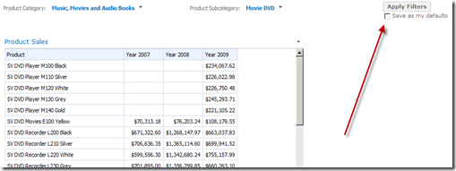
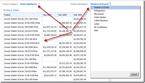
So, for those of you not familiar with the ‘Save as my defaults’ option here is what it looks like:

image

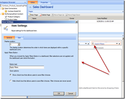
And it is part of the Apply Filters settings in the ‘Save options’ towards the bottom, you can either show or hide the check box to save the filter choices.

image

First off, the Apply Filters button allows users to make changes to the filters without the changes immediately refreshing the content they are connected to (similar to the View Report or Apply button for Reporting Services reports).

The ‘Save as my defaults’ check box pretty much does as it says, a user can make a selection, check the box, and then click the Apply Filters button.  This when then store the parameters for this particular dashboard page so that when the user returns to this page the selections will be restored.  So even if the user makes different selections from the list, PerformancePoint will remember the values that were saved when the check box was enabled.

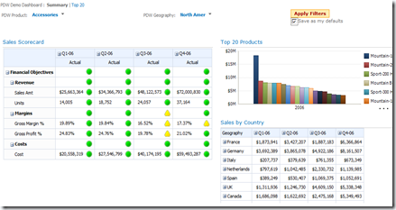
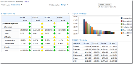
In the image below I make the selections ‘Accessories’ and ‘North Amer’ and check the box to save the defaults.

image

I then click the Apply Filters button and the dashboard items refresh and you will notice that the check box is disabled.

image

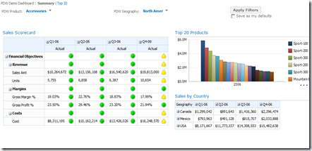
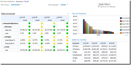
If I make a change to the geography filter and select Europe and click Apply Filters the dashboard items connected to the filters will refresh.

image

Now if I refresh the entire page (click F5) I see that my original filters that I selected and applied when using the ‘Save as my defaults’ check box are restored.

image

So this is pretty cool, but how does this work for a typical user that has view-only permissions to the dashboard.

image

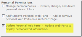
Well, it doesn’t because the option to ‘Save as my defaults’ is disabled.  Hmmm… well that doesn’t help.  So what is the secret SharePoint permission that needs to be added so that this is enabled without making the user a dashboard admin?  Good question.  Well I wasn’t able to find any documentation on this and even when these new features came out there wasn’t that much documentation.  Basically after a little trial-and-error (or guessing-and-testing) I came across the additional permission that is needed.  The permission that is needed is in the Personal Permissions section and is ‘Update Personal Web Parts – Update Web Parts to display personalized information.’

image

Once that is added then the check box is enabled for the user and can be used.

image

Pretty simple. 

NOTE: one thing I noticed with this, and I would say that it is a bug in my opinion (don’t believe this has been fixed in a CU), is that if the same filters are used on other pages and changed and you come back to the original page where you used the Apply Filters and ‘Save as my defaults’ option, the values will be overridden based on the selections on the other page.  The original defaults will not be used, so seems to be a scoping thing in my opinion as to how the filter values are saved, not working as I would expect, they are saved at the filter level versus the page.  So the defaults can actually be wiped out if the same filters are used on other pages without the Apply Filters button.  If the Apply Filters button is used on all pages then it appears you are okay.

Posted in PerformancePoint | Tagged: , , , | 3 Comments »

Using Perspectives with PerformancePoint Services

Posted by denglishbi on March 28, 2012

[tweetmeme source=”denglishbi” only_single=”false”]

One of the great features of using PerformancePoint Services in SharePoint Server is the ability to be able to drill down to (or cross drill) and perform additional ad-hoc analysis.  This features is built into the analytical reports, both grid and chart, as well as the decomposition tree.  Here is what the feature looks like with each of these options along with the output in an existing dashboard page in SharePoint:

Analytical Reports (Chart and Grid)

Initial Report Drill Down To menu Final Result
image image image
Sales chart displaying data by Product Category Able to Drill Down To any of the 14 dimensions that are in cube Home Appliance sales data drilled down to Machine Type – unrelated dimension to sales
image image image
Sales grid displaying data by Product Category Able to Drill Down To any of the 14 dimensions that are in cube Home Appliance sales data drilled down to Geography Region Country

Now the one thing you might have noticed when using this feature is that the list of available dimensions (entities) that are available in the list can become overwhelming at times if you are utilizing cubes that include many dimensions and fact tables (measure groups).  It is quite common that when cubes are setup this way that not all of the dimensions are related to each fact table.  Like if we look at this dimension usage design you can see that there are 14 dimensions and 7 measure groups and that there are quite a few instances where the dimensions are not related to the measure groups.  This can produce odd results based on how the measure group is setup in the cube such as the chart results above after the sales data was analyzed by machine type.

image

In these cases you then have to evaluate whether or not it even makes sense to include the fact tables in the same cube.  That is one option of course when designing your model, another is the ability to limit the items that you present to your users to help limit the scope.  The way you can do this is with the use of perspectives.  A perspective is a way that you can limit the scope of items that are presented to a user to help remove the clutter of items that are available.  This is subset of the cube and can then be exposed to users to select from so that they can quickly perform analysis on just the items that they need to reference.  Perspectives are not an option to use for security purposes, just an option to use to filter the items for analysis.

NOTE: In Analysis Services perspectives are only available as an Enterprise Edition feature (which is also available in the Developer and Evaluation Editions) with SQL Server (2005 through 2008 R2 versions). Now with SQL Server 2012 perspectives are also available in the new Business Intelligence Edition of the product (for both Multidimensional and Tabular) as well as in the new version of PowerPivot for Excel.

Before we explore this let’s take a quick look at the other type of visualization available for analysis that is provided in PerformancePoint that allows you to cross drill, the decomposition tree.

Decomposition Tree

Initial Report Drill Down To menu Final Result
image image image
Home Appliance sales amount broken out by Product Subcategory Able to Drill Down To only the related dimensions in the cube Washers & Dryers sales amount broken out by Channel Name

Notice anything different here? This type of report has built-in logic that only displays the related dimensions available to the measure that you are analyzing.  Pretty cool.

Ok, now back to our initial issue that we saw with the Analytical Reports.  If we look at the cube designer above and go to the perspectives tab we can see that three perspectives (IT Machine, Inventory, and Sales) have been defined for particular areas to focus in on the items that are relevant for their analysis:

image

So if we go back into PerformancePoint and if we setup our data source to reference the perspective instead of the cube we can then design our Analytical Reports off that data source.  In doing so we will then be able to limit the items presented to our end-users just like the decomposition tree does so that it only displays items relevant for analysis.

Here is an example of the chart initially displayed and the Drill Down To list based on a reference to the Sales perspective instead of the Operation cube in our Analysis Services database.

image

Now instead of being presented with all 14 dimensions we only see 11 of them.  In this case the Scenario dimension is setup in the Sales perspective and that is needed to evaluate the Sales Quota data.  We can see that in the decomposition tree that it filtered that dimension out.  Now you have the ability to control what is available for users by the use of perspectives.  These can also be used with out tools such as Report Designer, Report Builder, Excel, etc.  When users connect to your database they can select from a drop-down list and connect to a perspective if you have them defined and also if you are using a Edition of SQL Server that supports this.

As I mentioned in the Note above, in SQL Server 2012 perspectives are available now in the Business Intelligence Edition as well as Enterprise.  You can also defined perspectives now in the new release of PowerPivot for Excel as well.

image

When you are in the PowerPivot Window you will need to enable the Advanced Mode option in the file menu and then you will see the Perspectives button in the Advanced tab of the Ribbon.  This will only be active if you have data imported into the PowerPivot Window.  These PowerPivot files can then be utilized in PerformancePoint and I highlighted the new features in a previous posting (I did not mention perspectives though…) – Using PerformancePoint Services (PPS) with PowerPivot SQL Server 2012 RC0.

Summary

As you have seen it can be very helpful to limit the scope of items presented to a user for analysis.  As cubes get larger and more entities are added for analysis along with fact tables it can become quite overwhelming to end-users.  We can help out the users by providing perspectives which can provide a limited scope of items that are needed for analysis and that are related.  This can be very helpful and simplify things for end-users and can reduce confusion.  I would highly recommend that before you dive into creating lots of Analytical Reports that you define perspectives in your models.  The reason for this is because you cannot change the data source an Analytical Report is associated with once you have created it.

Happy analysis!

Posted in PerformancePoint | Tagged: , | 1 Comment »

Using PerformancePoint Services (PPS) with PowerPivot SQL Server 2012 RC0

Posted by denglishbi on February 9, 2012

[tweetmeme source=”denglishbi” only_single=”false”]

Last year I did a posting on Using PowerPivot with PerformancePoint Services (PPS) 2010. I thought it would be a good idea to do an updated posting with the new release of PowerPivot that will be coming out this year to show the new features that you will be able to take advantage of now.

Before we get started I need to point out that if you setup your SharePoint environment with a fresh install of SQL Server 2012 that you will also need to download and install the Analysis Services ADOMD.NET (version 10.5) data provider from the SQL Server 2008 R2 SP1 Feature Pack.

1033\x64\SQLSERVER2008_ASADOMD10.msi

I had previously tried to reference PowerPivot SQL Server 2012 in the “Denali” CTP3 and in RC0 release and received the following error message when trying to configure the connection string in the PerformancePoint data source setup:

An error occurred connecting to this data source. Please check the data source for any unsaved changes and click on Test Data Source button to confirm connection to the data source.

I was glad that after reporting this that a resolution was found and that simply installing the older version of the ADOMD.NET provider was able to bridge the gap to the new version of the PowerPivot files with PerformancePoint – You Can Use SQL Server “Denali” PowerPivot Models as PerformancePoint 2010 Data Sources.  After you install the version 10.5 release of the data provider you will need to perform a iisreset after the installation to get this working properly in your environment so that you can create the data source in Dashboard Designer.  The previous version of the ADOMD.NET data provider was not needed to connect to the new Tabular version of SSAS, just for PowerPivot.

What’s New?

Okay, so now that we got that covered what are we able to do with the new release of PowerPivot?  Let’s take a look and see what has changed.

New Features Available in PowerPivot (disclaimer: this is based on the SQL Server 2012 RC0 release of PowerPivot) to use with PerformancePoint:

  • Hierarchies! – yes, now we can define hierarchies in our data model such as Calendar with Year, Quarter, Month, and Date levels or Products with Category, Subcategory, and Product levels. In order to add hierarchies you have to use the new Diagram View that is another new feature to see a visual representation of your data model.  In addition to this you can also setup Parent-Child hierarchies as well with some of the new DAX capabilities with the PATH and PATHITEM functions to setup your levels and get at the relationships.
  • Measures and formatting – measures are defined in the PowerPivot Window and part of our model. Another very nice feature that we can do now is set the format for measures that we define in the data model. So if we want to display the sales or profit we can do this in currency or if we want to display gross profit margin we can do that as a percent and we can specify the comma separator and number of decimals as well.
  • Column sorting – in the R2 release of PowerPivot you might have noticed that everything was sorting alphabetically. So if you worked with say days of the week or month names you would have had to come up with some alternate naming conventions to get the values to display in the correct order that we are used to seeing them. Well in the 2012 release we now have the ability to base the sort order of a column off another columns, just like we can do in the Multidimensional Analysis Services development. So if we have a column for month number of year we can use that to properly sort the month names and we no longer have to incorporate the month number into the description that we display in our reports.
  • Key Performance Indicators (KPIs) – you can define these now in your data model, but unfortunately at the time of this post you are not able to import KPIs from Tabular data models.  There is currently an open bug on connect related to this issue – can’t make PerformancePoint scorecard by importing tabular KPIs (feel free to vote this one up).
  • Drillthrough (show details) – there is now drillthrough support for Tabular data models, so you can use the show details options on measures in your Analytical Reports. Granted you don’t have any abilities to customize the drillthrough output in PowerPivot models (Tabular will have this thanks to Greg Galloway and BIDS Helper), but you can see the detail data in the table that makes up the number.

Hierarchies

In the new Diagram View we can now right-click on a column in one of our tables and select the context menu option ‘Create Hierarchy’

image

We can then provide a meaningful name to the hierarchy (something besides Hierarchy1) and drag additional columns down into the hierarchy to add levels for users to provide the navigation path.

image

Now in this example I already used the RELATED function to pull in the product category and subcategory names into the product table.  I have also hidden the ProductSubcategory and ProductCategory tables from client tools so they will not be visible to the users when the data model is deployed (in the first image you can see that those tables are dimmed out, more transparent than the product table).  Now I might want to go ahead and rename the last item in my hierarchy here so that it is a little more cleaner.

image

In doing so you can see that in parenthesis I can still see the actual column in my data that it is referencing.  Now I could go ahead and hide the individual source columns that are being represented in our hierarchy.  This would force the users of the model to have to use the hierarchy to navigate the data.  That would be fine in most cases, but if you are going to use this data model with Power View you will want to keep them in the model since the initial release of Power View in SQL Server 2012 will not support hierarchies.  So if you hide them then you will not be able to see those columns or the hierarchy in your model and the users would not be able to properly analyze and report on the data.

In addition to the typical user defined hierarchies I also mentioned there is support for parent-child hierarchies.  So if you have a self-referencing table such as an Employee table that contains EmployeeKey and ParentEmployeeKey columns you can utilize DAX to establish the hierarchy path for each row and then defined the levels like the following:

image

=PATH(Employee[EmployeeKey], Employee[ParentEmployeeKey])

And once you have that setup you can setup additional calculated columns for each of the levels in the path that can then be used back in the Diagram View to establish the hierarchy just like the Products one above.

image

=LOOKUPVALUE(Employee[EmployeeName],Employee[EmployeeKey], PATHITEM(Employee[EmployeePath], 1,1))

image

Measures and Formatting

Another nice feature is the ability to designate the format output of the measures you define.  In the R2 release of PowerPivot you had to do this in Excel where you also created the measures and it was not actually part of the data model.  Well in this release not only is this capability part of the data model, but so are the measures.

First of all you have the ability to create and define explicit measures in your data model now.  There is a new portion in each table in our PowerPivot Window called the Calculation Area.  This is where we can define measures that will then become part of our data model.  Granted measures can still be created in Excel, but in doing this they will not get added back into the data model and exposed in the PowerPivot Window.

image

Now that we have some measures defined we can go ahead and add formatting to each of these by selecting the measure and using the Formatting section in the Home tab of the Ribbon or right-clicking on the measure and selecting Format… to open up the Formatting dialog box.

NOTE: when using PowerPivot with tools like PerformancePoint, Report Builder, and Report Designer (BIDS) you will need to define explicit measures.  Implicit measures will work in Excel with PowerPivot and in Power View, but not with these other tools.

image

The Calculation Area is a free form area and you can enter measures in any of the cells and the syntax you use is Measure Name:=[DAX Expression]

In the first screenshot above where I have the Reseller Total Sales measure I could actually take that and enter that in the Calculation Area in another table if I wanted.  In doing so I would have to alter the DAX a bit and make a direct reference to the table name like such – Reseller Total Sales:=SUM(ResellerSales[SalesAmount])

Column Sorting

In the v2 release of PowerPivot we now have the ability to define the way a column is sorted based on another column.  So for example in my Date table if I have a column called EnglishDayNameOfWeek with values Sunday, Monday, Tuesday, etc. and I have another column called DayNumberOfWeek with values 1, 2, 3, etc. I can set the sort order of the first column to be based on the second column.  If we did not do this then the names would simply be sorted alphabetically like they were in v1 of PowerPivot.  In v1 of PowerPivot you could simply sort the values in Ascending order in a PivotTable to correct this, but in Slicers you did not have that ability and would have to typically setup a calculated column to sort the values properly like 1 Sun, 2 Mon, 3 Tue, etc.

image

Once you have the column selected you can then select the Sort by Column option in the Ribbon.  This will then open up the Sort by Column dialog box where you can specify the column to be sorted and then which column defines how it should be sorted.

image

You can use this to not only get typical items sorted properly like the days of the week and month names, but you could also use this to define custom report sorting that users would like to see.  So say you have predefined names you use to categorize your customers based on their sales like Platinum, Gold, Silver, Bronze, etc. and this is how you want them displayed on your report (in this particular order).  Well now you can be defining another column in the table that has the values 1, 2, 3, 4, etc. respectively and setup the Sort by Column.

Key Performance Indicators (KPIs)

Defining KPIs in the PowerPivot models is a new feature that is available.  As I mentioned though, currently you are not able to import these into PerformancePoint to create an Analysis Services scorecard like you can with Multidimensional Analysis Services.  As an example though, here is what you can do if you want to set this up so that you can use them in Excel (which could then be displayed with Excel Services in your dashboard) or with Reporting Services (which could also be displayed in your dashboard).

First you need to define an explicit measure like we already did above with Reseller Total Sales.  Once you have this selected you can then click on the Create KPI option available in the Measures section of the Home tab in the Ribbon or you can right-click on the measure and select the option to Create KPI…  This will then open up the Key Performance Indicator (KPI) dialog box.

image

In the dialog box you can then specify the target to compare the measure to and this can reference another measure in the data model or an absolute value.  Once you have that defined you can then adjust the thresholds and select your icon styles.  Make sure you pick an appropriate icon style that not only has a color option, but also a shape to differentiate it because as I have noted before, there are people that are color blind (so do not just go with the default first icon style selection).

The other thing that you can do is specify some descriptions for the KPI (descriptions are another new feature and these are available on other items such as tables, columns, and measures).  The descriptions are then displayed to the end-user in say Excel when they are working with the PowerPivot field list and hovering over the items.

image

Once you have this setup you will notice a new icon next to the measure in the Calculation area (and in the Diagram View) which signifies that it is now configured as a KPI.

image

Just remember, you cannot import these currently into PerformancePoint, so you will still have to manually setup the KPIs.  Hopefully this will be resolved, just watch the Connect item link I provided above and feel free to vote it up as well.

Drillthrough (Show Details)

Not much to say here other than the fact that you can now get to the detail records that make up a particular measure value when displayed in Excel and in PerformancePoint.  So in PerformancePoint if you have the KPIs setup with the Data value calculation instead of the Default or you are displaying the measures in an Analytical Report you will now be able to select the Show Details option and actually display the individual rows that are in that table that make up the value.

The End Result – Dashboard in PPS

Okay, so now we know what the features are we can use, what do they look like in PerformancePoint.  Let’s take a look at that.

image

And last but not least….

image

Pretty sweet and I am looking forward to the new feature support.

If you are looking for the downloadable sample files for SQL Server 2012 take a look here SQL Server 2012 Samples ReadMe.

Posted in PerformancePoint, PowerPivot, SharePoint | Tagged: , , , | 10 Comments »

Twin Cities ScarePoint Saturday Follow Up

Posted by denglishbi on November 2, 2011

[tweetmeme source=”denglishbi” only_single=”false”]

I attended my very first SharePoint Saturday event in Minnesota.  I was extremely impressed with the organization of the event, speaker dinner was fabulous, and the location was very nice.  I was curious to speak to a SharePoint audience versus my typical SQL Server and Business Intelligence audiences.  I was impressed to find out that over half the audience that attended my presentation knew what PerformancePoint was and quite a few were using either PerformancePoint 2007, 2010, or even ProClarity.scarepoint sat

The presentation was going pretty good and we were going through the content at a good pace until all of a sudden out of the blue it was as if someone pulled the plug on my laptop.  My laptop decided to go into hibernation mode and I was not able to wake it back up.  I tried to disconnect and reconnect the projector, unplug the power, etc. and in the end I had to simply shut it down.  This was not a good thing because I had my virtual environment up and running all set to go for my demo as well.  Needless to say this generated some downtime, so I was fielding questions while I tried to get my laptop and environment up and running again to resume my presentation.  Pretty much threw my game off and I would have liked to have spent some more time with my demo to cover all of the features and provide more explanations.

I definitely apologize to the attendees of my session.  I was just in shock and couldn’t believe it.  I was very bummed out and felt awful, just something that you don’t plan on happening when presenting.

I think I probably spent too much time on the history and overview and should have done more demos and gone over maybe the setup of how PerformancePoint is enabled.  Just goes to show you that based on the SharePoint audience there are items that are of more interest and I should have focused on that versus what I am used to doing for a SQL Server and Business Intelligence group.

As with all presentations you get the feedback and learn on how to build off the experience to adjust and make the next one better.

Posted in PerformancePoint, SharePoint, Training | Tagged: , , , | Leave a Comment »

SharePoint 2010 Cumulative Update October 2011 is available

Posted by denglishbi on October 30, 2011

[tweetmeme source=”denglishbi” only_single=”false”]

UPDATE (11/3/2011): Apparently the documentation that was released is incorrect and should be updated shortly for PerformancePoint Services.  The issue with the context menu is going to be part of the December CU update, so stay tuned.

Just this past week another SharePoint 2010 CU was released.  The one thing that I wanted to point out is that there is a update for PerformancePoint Services (PPS) included in this CU.  What has fixed with PPS?  Additional support for the iPad devices!  There has been a long outstanding issue with being able to utilize the right-click content menu in Analytical Reports on iPad.SharePoint2010 (issue resolution not part of this CU, wait till Dec)

PerformancePoint Services hotfix (KB 2596590)
Issues that this hotfix package fixes

This hotfix package contains several fixes that enable PerformancePoint Dashboard on Apple iPad devices. These fixes provide the following improvements:

  • The fixes enable the “tap and hold” feature so that right-click to open context menus can be accessed. (issue resolution not part of this CU, wait till Dec)
  • The fixes provide several HTML and CSS changes to accommodate inconsistencies in the way that Apple Safari displays dashboards on iPad devices.

This is build 14.0.6112.5000 of the cumulative update package.

So if you have people trying to leverage iPad devices with your PerformancePoint dashboards in SharePoint 2010 go ahead and download the new CU to provide them the fully benefits of the analytical functionality.

Posted in PerformancePoint | Tagged: , , , | 4 Comments »

PerformancePoint 2010 Cascading & Apply Filters – SP1 Features

Posted by denglishbi on June 29, 2011

[tweetmeme source=”denglishbi” only_single=”false”]

I downloaded and installed SharePoint 2010 SP1 so I could check out the new additions the PerformancePoint.  Typically you would only see hotfixes included in a service pack, but in this one we get a few new features like cascading filters and a new apply filters button (with saving defaults filter) options.  Let’s take a quick tour of these new features to see how you use them and what they do to your dashboard pages.

Cascading Filters

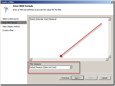
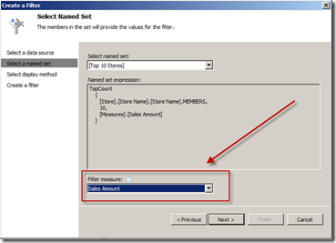
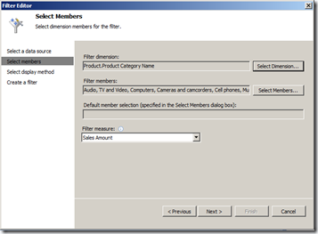
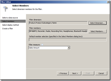
This is not a new concept, but for PerformancePoint it is.  In Reporting Services you have always had the ability to setup parameters so that the selection in one parameter list would be able to filter the available values in another parameter list.  Well now this has been added to PerformancePoint and it is available with the Multidimensional Filter types – Member Selection, MDX Query, and Named Set filter types.  When you go to create a new filter of one of these types you will see a new setting in them.  This new option is to select a measure (metric) that will be used to pass a query to the other filter to return the list of available values that satisfy that query.

Member Selection

image

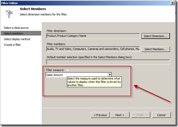
The new selection is the ‘Filter measure:’ option and the informational dialog box states the following:

Select the measure used to determine which values to display when this filter is driven by another filter.

This is the measure (metric) that will be used in combination with the filter member values passed to this filter to display the available list of values to the end-user to select from. So if I had a filter that was for Product Category and passed that to another filter that was Product Subcategory and the Product Subcategory was configured with ‘Sales Amount’ measure then the Product Subcategory filter would display a list of items that had ‘Sales Amount’ for the Product Category items that were selected.  A tad bit confusing perhaps, but this is how it works.

MDX Query

image

Named Set

image

This option is not available with the other filter types, just the ones displayed above – Member Selection, MDX Query, and the Named Set.

Ok, so now that you have a tour of that new option lets setup a dashboard with a couple of filters and a report.

Create Filters

Member Selection – Product Category

image

Member Selection – Product Subcategory

image

Create Analytical Grid Report

image

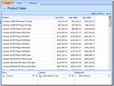
In this report I used the Product hierarchy and chose only the Product Name descendants of All, picked the Calendar Year hierarchy, and placed the Sales Amount measure in the background. I also used the filter option to remove blank rows and columns.

Create Dashboard and Connect the Items

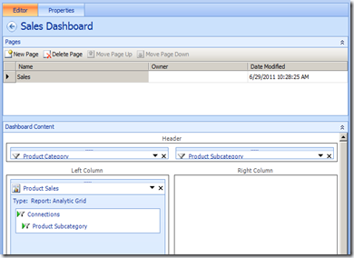
image

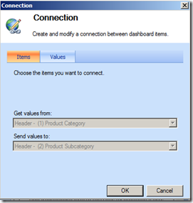
For the connections I connected the two filters together and then connected the Product Subcategory to the Product Sales report.

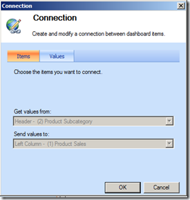
Connection to the Product Subcategory filter

image  image

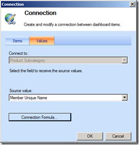
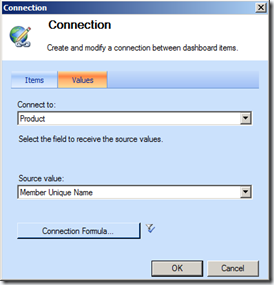
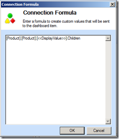
Connection to the Product Sales Analytical Grid Report – uses a connection formula as well

image  image  image

In this example I am leveraging a Connection Formula.  The reason I am doing this is because the hierarchies that are involved in this example.  I am not referencing the same hierarchy in each item and I want to be able to display the product names in the report instead of the subcategory values.  So I am taking the display name in the subcategory filter and using that in a formula to return the children (product names) in the report.

Deployed Dashboard in SharePoint

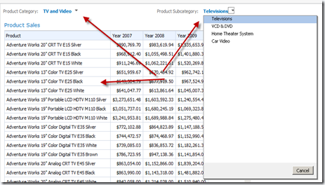
image

You can see that the subcategory filter is filtered by the category filter and only the ‘Tv and Video’ subcategory members are being listed.  The subcategory filter selection is also filtering the report which is displaying all of the product names that are associated with the ‘Television’ subcategory.

If we make another selection in the category list we will see everything get updated again.

image

Pretty slick.

Ok, now on to the other new feature that was added into the service pack 1 – Apply Filters Button.

Apply Filters Button

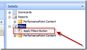
When you setup a dashboard now you will see a new selection in the Details pane in the Filters section called ‘Apply Filters Button’.

image

So what is this for?  Hmmm, is this something similar to Reporting Services perhaps?  Answer – Yes, with an added bonus.

image

If you drag and drop this onto the dashboard page and go into the edit settings for this new item you will get some options you can configure.  The first one is the text that you would like to be displayed on the dashboard page for the button.  And the next one is whether or not you would like to provide a checkbox for the end users to be able to save their selections for this dashboard page – this will be stored as their default values for these filters.  This means that when they come back to this page at a later time these filter selections will automatically be selected for them.  In the past the last selection of items from the filters was always saved and stored for the users, but now they have the control to determine which values get saved (if you want them to – optional).

image

The other thing about this new feature is that when you make selections from the filters the items in the dashboard (with the exception of linked filters) will not be filtered.  In order to get the other items to filter on the dashboard you need to click the button.  Once you do this your scorecards and reports will refresh and display the data based on the selections in the filters (assuming they are connected of course).

I was hoping that this feature might somehow allow you to retain your default member selection settings in the initial filter setup, but that does not appear to be the case.  The application still retains the last selection by the user unless you provide them the ability to save their own defaults with the new ‘Apply Filters Button’ option.

Anyway, these are just a couple of the new features along with hotfixes that are available in service pack 1.

Check out more information here:

Enjoy!

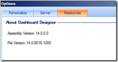
By the way, after I upgraded to SP1 the build version of Dashboard Designer was the following:

image

14.0.6016.1000

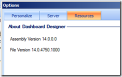
Prior to the upgrade it was:

image_thumb2

14.0.4750.1000

I had installed a hotfix prior to doing the service pack 1 install.  I wanted to check out some other fixes before this release – PerformancePoint Services 2010 (PPS) Hotfixes.

Posted in PerformancePoint | Tagged: , , | 43 Comments »

PerformancePoint Services 2010 (PPS) Hotfixes

Posted by denglishbi on May 5, 2011

[tweetmeme source=”denglishbi” only_single=”false”]

Yesterday I decided to take a quick glance at the TechNet Support site to see if there had been any new hotfixes released for the latest version of PerformancePoint.  I know that there was a fix added in SQL Server 2008 R2 CU5, PerformancePoint Services 2010 Analytical Grid Filter Fix, Sort of, but I was wondering if there was anything else.  Well it turns out there has been.  So far I was able to track down 3 hotfixes in addition to the SQL CU and then there has also been a SharePoint CU as well that includes these as well.

Title KB Article Information
SharePoint Server 2010 Cumulative Update Server Hotfix Package (MOSS server-package): March 3, 2011 KB 2475878 Cumulative update of hotfixes for SharePoint Server 2010
PerformancePoint Server 2010 hotfix package (ppsmawfe-x-none.msp, ppsmamui-xx-xx.msp): February 22, 2011 KB 2496951 Query String (URL) filter web part fix with scorecards and decomposition tree
FIX: An analytic grid that is connected to SSAS 2008 R2 returns incorrect data when you apply a filter to the analytic grid in PerformancePoint Dashboard Designer KB 2463203 The fix for this is actually included in CU 5 for SQL Server 2008 R2. Refer to my blog posting above that discusses the issue and shows what has been done. There is a forum thread in regards to this as well – filter value function not working on analytic grid
PerformancePoint Server 2010 hotfix package (ppsmamui-xx-xx.msp, ppsmawfe-x-none.msp): December 14, 2010 KB 2466270 Scorecard fix for dimension names that include a % symbol.
PerformancePoint Server 2010 hotfix package (Ppsmawfe.msp): October 26, 2010 KB 2422440 Fix for Decomposition Tree displaying captions in multiple languages for the MUI


So far this is all I have tracked down.  Hopefully now that this is fully baked into the SharePoint product now, for the most part, that the hotfixes and updates will be released a bit more frequently and be easier to track down.  Maybe the PPS team will even blog about them as well?  After all they took a six month break from blogging, so hopefully they have some good stuff built up to share now.

If you are looking for a list of fixes for PerformancePoint 2007 I have one compiled here – PerformancePoint Server 2007 Build List and Hotfix Update.

Posted in PerformancePoint | Tagged: , , | 1 Comment »

PerformancePoint Services (PPS) Wish List

Posted by denglishbi on February 11, 2011

I have been working with the PerformancePoint product since the early CTP days back in 2006.  I previously had experience using the ProClarity product that was acquired and partial converted into the PerformancePoint product.  With the release of PerformancePoint Services in SharePoint 2010 last year there have been some significant enhancements and additions to the product, but there are still some items that we would all like to see.  Over the years I have read and heard complaints of features that are missing.  Some of these are valid, but there are others where I can see why it was ‘by design’.  Below I have compiled my list of items that I would like to see included and enhanced in the product.

1. Include the ProClarity Performance Map (Heat Map) and Perspective reports – these are two ‘key’ and extremely informative options that have just been glossed over and would add so much value to the product offering.  I am baffled why they have not been included.  I find these two views more valuable than the Decomposition Tree that was finally added into the current release (although it still can not be a starting point, it is available to use to explore the multidimensional data).  The ability to analyze two metrics at the same time to determine impact and search out anomalies is a must.  Even though ProClarity views can still be referenced in current product, it just is not the same and requires setup and configuration of additional product.

ProClarity Performance Map viewProClarity Perspective view

2. Allow users to save and share analytical views (reports) – often when users are exploring existing analytical reports they come across a new and interesting view of the data.  It would be great if this view of the report could be saved to use as a starting point and shared with other users to help streamline report creation and sharing of information.  Another feature that was available in ProClarity.

3. Provide Analytical Map report – another nice visualization feature that was added in SSRS 2008 R2 and is available in other competing products.  It would be nice to have this option available even though you can leverage the SSRS reports in PerformancePoint to add more value to the product offering.  Enhance the map experience as well with zooming and dragging functionality as well just like users would expect.

4. KPI alerts – this was available in Business Scorecard Manager so that you could receive notifications based on criteria – Scorecard Alerts in BSM 2005.  This did leverage SQL Server Notification Services and I have heard rumors of a new alerting mechanism coming in the near future.  Currently there is a solution that you can purchase – Bidoma Alert.

5. Ability to control chart types for data series in Analytical Reports – current version provides option to include a bar (actually a column, but called a bar…) and line chart option if one of the measures is a percentage (automatically generates second y-axis).  ProClarity provided way to select a data series and chose the options independently of each other and they could be the same data type – this allowed you to show say current year sales measure in columns and previous year in a line.

6. More Analytical Charting options – provide the ability to select or provide a color scheme (you can do this in the other Microsoft products, why not here as well?); include axis labels; add more chart types – bar (in addition to the column charts already included that are called bar), area, range, polar, funnel, scatter, polar, gauges; include 3D option (although I am not a fan of the 3D, it does provide some eye candy); make data labels optional (would be great for Pie charts which are just another bad visualization, but people like them); add zoom support to select and zoom in/out in portions of the reports.

7. More linking (connection) options – ability to link filters to each other to create cascading filter functionality, ability to link Analytical reports to other items (if I can link to them, why not the other way?)

8. Provide dashboard preview functionality in Dashboard Designer – why do I need to deploy the dashboard to view how it will look and function?  I can preview Report Builder, why not in Dashboard Designer as well?

9. Enhance Person Responsible property – tie this into Active directory and provide the ability to quickly interact and view that person’s contact information and status.  Currently have to use additional web parts for this functionality.  Ability to include mailto for hyperlink would be nice, but doesn’t appear to be an option like it was in BSM 2005.  Being able to view status and availability would be extremely nice and you can do this with SharePoint lists

10. Provide printing and export functionality for dashboard and report items – ability to export each item independently is there, but not the whole dashboard, plus printing options to print and scale a dashboard or individual report would be great feature.  There is a printing option you can purchase though – PerformancePoint Print WebPart.

11. Add slider filter option for Time filters – users continue to ask for options to be able to selected a start and end date type of filter.  By adding a slider filter option so that the user can select a starting and ending point range for the filter would be a very nice option.  This is available in other competing products.  So for example here is a slider control filter from Bing Travel that allows me to select a range of time

 slider filter

12. Bring in the Silverlight charts – end users like the eye candy and adding in the Decomposition Tree only brings about the question why not in the other Analytical Reports.  Enhance the visuals so that they look appealing to the consumers.  For me it is all about the data and information, but the consumers also want the experience and visuals (like the Pie chart).  In the end it is the end users that will be using the tools and pay for the product, if we can enhance and make the experience appealing and blow them away with neat visuals than this will only increase user adoption rates.  Unleash the Silverlight toolkit and bring it into PerformancePoint analytical reports.  Russell Christopher has a couple of outstanding examples of the sliding bubble chart and heat map – bring these visualizations into the product to provide more value.  We have all been waiting for the Hockey Treemap Visualization to become a reality and part of the product offering, why has the heat map not been added yet?

sliding bubble chartheat maptreemap visualization

13. Ok, I need one more for the bakers dozen.  Mobile version for phones.  Okay, you can view the SharePoint dashboard pages on the tablet and pad like devices (sorry I just can’t say the Apple words).  The functionality isn’t too bad.  What about for the phones?  Being able to provide a version or app that can be installed to display Analytical reports that have been developed would be a nice feature.  Maybe this can already be done and since I just use my phone for a phone and not all of the enhanced online capabilities it is just my lack of knowledge here.  We can definitely see that the push to mobile like devices and access to information away from the desk/office is definitely happening, so provide a solution leveraging the items that have already been created.

We definitely need a better way to communicate with the product team like there is for SQL Server so that bugs and suggestions can be easily shared and monitored.  Creating support cases and sending feedback into a black hole is not convenient.  Leaving comments on the product teams blog is not a good long term solution either, why can’t we use the Microsoft Connect site to communicate with the team like we do with SQL Server? (maybe we can and I am just not aware of it)

I am not the only one that is requesting similar features and functionality.  For more items (and some of these have been added in PerformancePoint 2010) take a look at this thread in the PPS M&A forum – PerformancePoint Monitoring Feature Suggestions.

If you have more items like you would like to see, please leave comments, who knows, maybe someone is listening and reading this and we can get these on the list for the next release of PerformancePoint assuming that this is still on the radar for maintaining this product and that it will not be swapped out with something else like ‘Crescent’.  I know that ‘Crescent’ is supposed to be a reporting tool, but it sure does provide a lot of analytical capabilities just like PowerPivot.

Posted in PerformancePoint | Tagged: , | 8 Comments »

Book Review: Microsoft SharePoint 2010 PerformancePoint Services Unleashed

Posted by denglishbi on January 10, 2011

I finally wrapped up my read of the Microsoft SharePoint 2010 PerformancePoint Services Unleashed book by SAMS publishing.  I was not provided the book to review, so just want to state that up front.  I thought that the authors did a great job going over the product providing an overview, installation information, component breakdown, dashboard development, PerformancePoint 2007 differences and migration, and custom development.  I thought the authors did a very good job explaining the product and they even had a case study in regards to Apples and Oranges which is a broadcast company wanting to evaluate The Green Orange show.  I definitely like the idea of bringing in the case study, just not sure if that theme was pushed throughout the rest of the book showing how the product helps them to be able to monitor and analyze information about the show.

I liked that the book included Notes, Tips, Summary, and Best Practices in each chapter.  Getting some additional insight and tips from the authors was good to help explain and provide some additional guidance and reasoning.  I liked chapters 11 and 12 where the authors showed how you can interact with the API, perform custom development with the SDK, and manage the product leveraging PowerShell scripts.

If you are new to the PerformancePoint product and will be working with the SharePoint 2010 product I would definitely recommend picking up this book as a reference point.  I think it does a good job providing examples and will prepare you for building dashboards with the product.  I think if the case study would have been fully incorporated along with some more dashboarding explanation and advanced PerformancePoint topics that would have really completed the book.  The end chapters that I mentioned above did help though.  I think the book could have been just a tad bit longer.

All-in-all I would give it a 3.5 out of 5 (five being the highest) rating – image and the price that you can get it for is definitely reasonable, plus I believe this is the only PerformancePoint 2010 book that is currently available.  There are a couple of items available for download that you can take a look at (an Excel file and SSAS backup) once you register the book on the Informit site.

Microsoft SharePoint 2010 PerformancePoint Services Unleashed (9780672330940): Tim Kashani, Ola Ekdahl, Kevin Beto, Rachel Vigier: Books

ISBN: 0672330946
ISBN-13: 9780672330940


And just an FYI, you can install and use Per User Identity authentication for security on a data source in a single server environment (farm setup).  This does work, you do not need to do a standalone SharePoint install.

Posted in PerformancePoint | Tagged: , , | 1 Comment »

Using PowerPivot with PerformancePoint Services (PPS) 2010

Posted by denglishbi on January 3, 2011

[tweetmeme source=”denglishbi” only_single=”false”]

UPDATE (6/20/2011): Modified table layout of step-by-step walkthrough to be two columns instead of three.  Added a downloaded PDF file as well.

UPDATE (2/24/2012): I have a blog for using PowerPivot 2012 with PerformancePoint Servers here – Using PerformancePoint Services (PPS) with PowerPivot SQL Server 2012 RC0.

Analysis Services was one of the primary data sources with the previous version of PerformancePoint to get the most functionality out of the product.  Now with the release of the 2010 product we have some new options and one of them is PowerPivot.  PowerPivot is also a multi-dimensional data source and in this post I will talk about what this source provides for functionality and what it does not compared to Analysis Services.

First of all you will need to have an environment that has PerformancePoint Services configured.  If you are not familiar with how to do that you can take a look at this great posting on the product team’s web site – Deploying PerformancePoint 2010 Soup to Nuts.  Once you have that setup then the other thing that you are going to need to do is have PowerPivot setup with SharePoint so that we will be able to utilize the files as data sources.  There are plenty of articles and material available in regards to this configuration, here is one of them – How to: Install PowerPivot for SharePoint on a New SharePoint Server.

Once you have your environment setup and ready the next thing will need to do is create your PowerPivot data source that you are going to leverage to create your dashboard with.  In this example we are not going to be creating the file and leveraging the PowerPivot PivotCharts and PivotTables, we are simply going to be setting up a file that will be used to provide the data and measures needed for analysis.  I will be using it in place of having to implement an Analysis Services solution (except for the fact that PowerPivot is really an Analysis Services database under the hood).

Some of the reasons that we might want to use PowerPivot in a PPS dashboard would be because:

  • ability to leverage PPS analytical features like analytical grids & charts and decomposition tree
  • quickly integrate disparate data for analysis into a single source
  • leverage existing Excel Power User expertise, data, and files

For this example I will be leveraging the Contoso Retail BI Demo data – Microsoft Contoso BI Demo Dataset for Retail Industry.  I will also be using the following components to put this example together – Excel 2010 with PowerPivot add-in (this can be downloaded from here – PowerPivot Download), PowerPivot for SharePoint 2010, PerformancePoint Services, and SharePoint 2010 Enterprise.

Warning: This example does not include each step-by-step instruction and expects that you have some basic knowledge of PowerPivot, DAX, and PerformancePoint.

image image
First step is to launch PowerPivot Window from Excel 2010 to load data Now from the PowerPivot Window we will select the option to load data from a SQL Server database
image image
Select the ContosoRetailDW SQL Server database Choose the option to select from a list of database tables
image imageimage
In this example we will select DimDate, DimGeography, DimProduct, DimProductCategory, DimProductSubcategory, Dim Store, FactSales, and FactSalesQuota For the two fact tables we will remove a few columns that are not needed for analysis during the load using the Preview & Filter option (remove initial fact key column and last three ETL columns).  Also add a filter for FactSalesQuota on ScenarioKey to only include values of 2 (for Budget)
image image
Now you can click finish and watch the data load – over 5 millions rows of data! During the load process the relationships that were defined in the SQL database were retained, so we will not need to setup any additional relationships between the tables
image image
image
We might simplify the snowflaked model and pull the Product Category and Subcategory information into the Product table using DAX and the RELATED function To simplify the model a bit more we can remove columns and tables that are exposed to the PivotTable in Excel – remove the surrogate key, foreign key, ETL columns, and in the related tables remove all columns
imageimage image
Now the creation of the PivotTable data (measures) which will be needed in PerformancePoint to reference – I will comment on this more down below after the example Measures have been added for PerformancePoint, so now the file can be published to SharePoint to be referenced
image image
File –> Save & Send –> Save to SharePoint –> Save As (this will be saved to a Trusted Excel Services location in SharePoint) In Dashboard Designer a new Data Source will be created – go into the Data Connections library and add a new PerformancePoint Data Source (this will launch Dashboard Designer)
image image
Create a Multi-Dimensional Analysis Services data source and use a connection sting pointing to the Excel file in SharePoint – “DATA SOURCE = http://mybi10/Workbooks/ContosoSalesAnalysis.xlsx” and the cube name is “Sandbox” If you receive this message when setting up the data source to pick the cube you will need to verify the connection string URL and/or verify that the SQL Server Browser service is running
image
image
image
Now create a couple of KPIs for Sales and Gross Margin information (you will need to use the Add Lists option in the Workspace portion of the Ribbon to add the PerformancePoint Content list). Make sure to change the Calculation option from Default to Data Setup a Scorecard and add a dimension column (ProductCategory) to analyze
image image
Create an Analytical Chart (you need to save the data source if you haven’t done so yet to create the analytical reports). To apply formatting to the measures switch to Grid report type and change formatting to $ and %.  Also filter empty axis and series Add another Analytical Chart. Apply appropriate formatting and filter to axis and series
image image
image
Add an Analytical Grid. Adjust Settings so that the column and row headings are not truncated in the View options in the Ribbon Create a couple of Filters, one for the FiscalYear and another for RegionCountry (an MDX Query was used along with the Tree view setup for each filter)
image image
Create and setup the Dashboard Connect the filters to the Dashboard items
image image
Save all of the content and then deploy the Dashboard to SharePoint View and test the dashboard page
image
image
View the Decomposition Tree (requires Silverlight)

A couple of items that I wanted to discuss briefly about in regards to this example was the reasoning for setting up measures in the PowerPivot PivotTable and the other was for setting up the KPIs Calculation as Data Value.  External tools require that you setup measures in the PowerPivot file in our to reference.  Whether you did this in PerformancePoint or Reporting Services, you would need to have measures defined to be able to reference to utilize for analysis.  PowerPivot doesn’t have the ability to setup formatting either to pass through, so you also have to perform this in the tools referencing it currently.  You can reference items placed in the PivotTables in the Values section, but you can’t guarantee these will always exist, so I recommend setting up measures for every metric that you want to evaluate and utilize with external tools.

The other items that I wanted to mention was the KPI calculation setting.  This was changed to Data value so that we would be able to leverage the Decomposition tree option in the right-click context menu.  If this was left as Default value this would have been disabled.  You currently cannot use the Show Details option since drillthrough is not an option in the current PowerPivot release, but you can use the Decomposition tree for analysis.

For the most part PowerPivot provides very similar functionality when compared to Analysis Services.  A few items that you don’t get will be Show Details (Drillthrough), Named Set references, measure formatting (along with formatting configurations – colors), and user-defined hierarchies.

For a good reference point for this type of a setup take a look at this white paper – PerformancePoint Services and PowerPivot for Excel (white paper).

This white paper covers the basics of integration between PerformancePoint Services in Microsoft SharePoint Server 2010 and Microsoft SQL Server 2008 R2 PowerPivot for Microsoft Excel 2010. It describes the basics of utilizing a PowerPivot model in PerformancePoint Services and expands on issues and scope of using these applications together.

Well that was a really brief and fast example of using PowerPivot with PerformancePoint, but you can see how quickly you can build out a fairly advanced dashboard that provides insight and analytical functionality to the end-users.

If you liked this posting you might also be interested in my other two that are similar for Excel Services and Reporting Services:

Enjoy!

Download:

image

Posted in PerformancePoint, PowerPivot | Tagged: , , | 23 Comments »